Ever since Huawei popularized the 16:10 wider aspect ratio with the Pura X, major Android hardware makers including Honor, OPPO, and vivo have been testing wider form factors across their flagship labs. When consumers pick up these experimental wide slabs at retail counters, their immediate impression is that the display feels distinctly broader, closer to holding a compact paper notebook than a traditional narrow phone. On official spec sheets and retail listings, marketing teams frequently label both tall narrow phones and wide slabs with the generic 6.7-inch screen tag. Buyers naturally assume that identical diagonal ratings offer identical viewing room, until they compare both handsets side by side and discover that the visual experience is entirely different.
That noticeable contrast comes down to display proportions. Most modern slab phones rely on tall 20:9 panels, but widening that aspect ratio allows screens to display substantially more text and graphics across a similar chassis footprint. A wider canvas transforms everyday mobile reading, making digital books, multi-column research briefs, and financial charts far easier to read. Beneath the glass, gaining just four or five millimeters of horizontal space allows engineers to install massive 6500mAh to 7000mAh silicon-carbon batteries in a single flat cell. However, wider bodies come with real ergonomic trade-offs. Once total chassis width crosses the 76-millimeter threshold, single-handed thumb typing and navigation become noticeably difficult. Calculating where that extra display area comes from, understanding why hardware teams are building wider slabs, and verifying hand comfort before buying helps ensure you choose the right phone for your routine.

The geometry behind diagonal screen ratings and why 16:10 fits more text per page than 20:9
When buying a phone, many people focus exclusively on diagonal inches, assuming that a 6.7-inch display is universally larger than a 6.3-inch screen. Tech marketing reinforces this habit by treating diagonal numbers as the definitive yardstick for screen size. Yet basic geometric rules tell us that for rectangles with similar diagonal measurements, proportions closer to a square encompass substantially more surface area. When a rectangle is stretched into an elongated strip, actual surface area shrinks.
We can see this clearly by comparing real-world devices currently on the market. Mainstream 6.7-inch flagships such as the vivo X200, OPPO Find X8, and Honor Magic7 use tall 20:9 displays. These screens measure approximately 70 millimeters in active width and 155 millimeters in height, delivering roughly 108 square centimeters of active surface area within chassis widths between 74 and 75 millimeters. Meanwhile, the Huawei Pura X unfolds into a 6.3-inch 16:10 wider display. Even though its diagonal measurement is 6.3 inches, which is 0.4 inches smaller than a standard 6.7-inch tall phone, its squarer proportions produce an active display area of roughly 106 square centimeters within a comfortable 74.3-millimeter chassis width. Despite a smaller diagonal rating, the usable viewing area is virtually identical to that of a 6.7-inch tall flagship.
When manufacturers apply these wider proportions to full 6.7-inch diagonals on upcoming slabs, the surface expansion becomes even more dramatic. Shifting a 6.7-inch panel from tall 20:9 to a balanced 18:9 ratio expands active screen width from 70 millimeters to 76 millimeters, increasing active display area to 116 square centimeters, an immediate gain of roughly 7 to 8 percent. Pushing proportions further toward 16.8:10 or 16:10 expands the active area past 120 square centimeters, delivering 10 to 12 percent more screen room than a 20:9 panel sharing the exact same diagonal rating. That difference gives users roughly ten percent more usable space per page.
| Form Factor and Device Example | Display Size and Ratio | Active Display Width | Active Surface Area | Area Difference vs 20:9 Tall Format |
|---|---|---|---|---|
| Standard Tall Flagship (vivo X200, Find X8) | 6.7-inch 20:9 | Roughly 70 mm | Approximately 108 cm² | Baseline active display area |
| Huawei Pura X Foldable (Unfolded State) | 6.3-inch 16:10 | Roughly 85 mm | Approximately 106 cm² | 0.4" smaller diagonal with identical area |
| Mainstream Flagship Adjustment (19.5:9) | 6.7-inch 19.5:9 | Roughly 71 mm | Approximately 109 cm² | Roughly 1% area gain |
| Balanced Wide Slab Prototype (18:9) | 6.7-inch 18:9 | Roughly 76 mm | Approximately 116 cm² | Roughly 7% to 8% area gain |
| Extra Wide Slab Prototype (16.8:10) | 6.7-inch Wide | Roughly 81 mm | Approximately 121 cm² | Over 10% to 12% area gain (10% extra room) |
That extra ten percent of screen real estate delivers practical benefits during everyday reading. On traditional 20:9 tall screens, narrow horizontal margins restrict how many words fit on each line, forcing readers to scroll constantly through articles and digital documents. When viewing two-column PDF reports, financial spreadsheets, or stock market candlestick charts, narrow screens cramp typography, compelling users to pinch, zoom, and drag across the page. On a wider aspect ratio screen, horizontal width expands naturally, fitting three or four additional words per line in ebooks and articles while rendering full spreadsheet columns without shrinking font sizes. When using split-screen multitasking, placing a tutorial video on top while texting below leaves ample room for the virtual keyboard without crushing the messaging window into an unusable sliver.
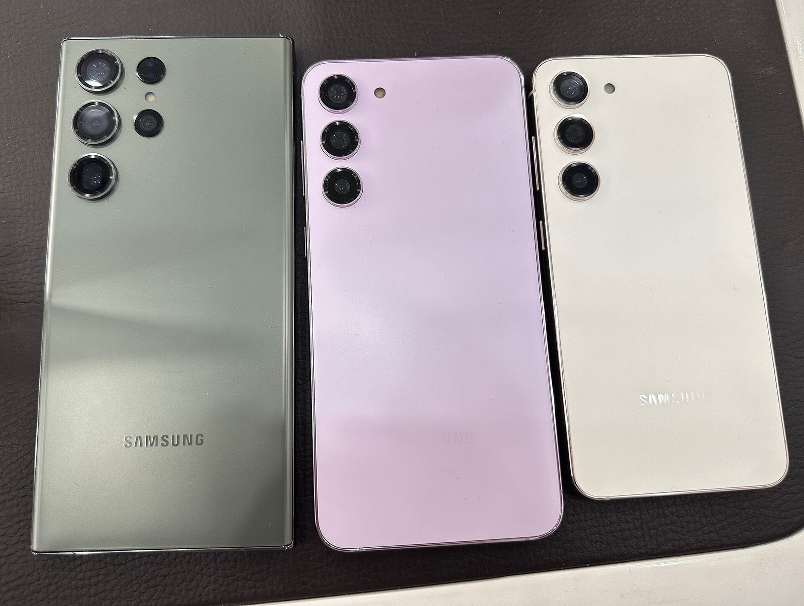
Why hardware teams are reviving wider slabs to pack larger batteries without foldable crease trade-offs
Given the obvious reading advantages of wider screens, why did the Android industry spend years standardizing on narrow 20:9 panels, and why are engineering teams returning to wider slabs today. The shift reflects a combination of consumer fatigue and practical breakthroughs in internal component packaging.
Smartphone makers originally embraced tall aspect ratios to preserve comfortable hand grip during an era of thicker bezels. Yet after six or seven years of narrow panels, flagship lineups from two hundred dollars to over a thousand dollars began looking like identical glass rectangles. Foldable smartphones offered expansive screens, but book-style foldables carry steep price tags exceeding fifteen hundred dollars, feel heavy in pockets, and remain relatively bulky when folded shut. Clamshell flip phones look compact, but their dual-cell designs restrict battery capacities to modest 4500mAh to 5000mAh limits, and their flexible central creases remain a persistent annoyance for many buyers. A wider rigid slab eliminates mechanical hinges and flexible screen creases while preserving standard flagship pricing, offering hardware brands an effective way to stand out.
Beyond aesthetics, the strongest incentive for hardware teams lies beneath the glass back cover. Modern flagship cameras demand enormous physical volume. Large one-inch main sensors and periscope telephoto modules consume most of the upper chassis, using bulky prisms and optical stabilization motors. In narrow 20:9 bodies, camera hardware squeezes the battery compartment into a long, slender trench. To squeeze in 5000mAh capacities, engineers previously had to design complex dual-cell or stepped batteries, increasing manufacturing costs and preventing thinner phone profiles.
Widening the chassis by just four or five millimeters completely transforms internal layout options. Logic boards no longer need aggressive cutouts to route antenna lines around telephoto lenses, and battery bays can accommodate a single expansive battery cell. Paired with next-generation silicon-carbon anode chemistry exceeding 750Wh/L in energy density, wider slabs easily house 6500mAh to 7000mAh batteries while keeping device thickness under eight millimeters. Compared to clamshell foldables with modest 4500mAh capacities, wide slabs deliver overwhelming battery endurance. A single wide cell also generates less internal heat, charges more efficiently, and spreads warmth across larger graphite cooling sheets. For hardware teams balancing camera zoom, battery runtimes, and thermal management, adopting a wider aspect ratio represents an exceptionally practical engineering upgrade.
The 76mm chassis width ceiling, letterboxing on 21:9 cinema video, and app scaling checks
Every industrial design shift brings practical compromises alongside its benefits. While wider slabs offer superior reading immersion and massive battery capacities, widening a phone creates distinct physical hurdles in daily use. Shoppers drawn to wide slabs should evaluate three specific constraints when testing devices in retail stores.
The primary physical benchmark to evaluate is the 76-millimeter chassis width line. Anthropometric research and ergonomic grip testing establish 76 millimeters as the comfortable threshold for single-handed mobile operation among most adults. Mainstream 6.7-inch flagships keep overall chassis widths between 74 and 75 millimeters, with the vivo X200 at 74.8 millimeters and the OPPO Find X8 at 74.3 millimeters. Within this span, an adult thumb comfortably sweeps across the virtual keyboard while fingers support the opposite frame securely.
When device width expands beyond 76 millimeters to reach 77 or 79 millimeters, comparable to older iPhone Pro Max models at 77.6 millimeters or wider prototypes near 78 millimeters, single-handed ergonomics deteriorate for users with average or smaller hands. Reaching the left-hand edge of the screen to swipe backward becomes difficult, and tapping keys on the far side of the keyboard requires shifting your grip, increasing accidental drop risks. If you routinely text with one hand while holding a subway rail or carrying groceries, a 78-millimeter wide chassis feels bulky and unstable. Slipping a wider phone into fitted front pockets can also cause the device corners to press uncomfortably against your thigh when climbing stairs. Testing a floor model in one hand and verifying thumb reach across the diagonal back button is an essential first check.
The second factor to inspect is video letterboxing during widescreen playback. Contemporary streaming movies and prestige cinema series are predominantly mastered in ultra-wide 21:9 formats. On traditional 20:9 tall displays, 21:9 movies fill nearly the entire screen with minimal black margins. On squarer 16:10 or 16.8:10 displays, the mismatch between video and screen ratios produces thick black letterbox bars along the top and bottom edges. Under those conditions, active movie image area is barely larger than on a standard compact phone. Wider screens excel when viewing standard 16:9 television episodes, documentaries, or vertical video clips, but movie enthusiasts must expect noticeable letterboxing during widescreen streaming.
The third area requiring verification is horizontal visibility in mobile gaming. Popular competitive titles such as Honor of Kings calculate field of view by locking vertical heights and expanding viewable peripheral area along the horizontal axis. On a tall 20:9 screen, players enjoy wider peripheral vision across side river lanes and jungle paths, spotting approaching opponents early. On a wider squarer screen, the reduced horizontal ratio slightly narrows peripheral view compared to tall narrow panels, showing slightly less sideline information.
If you routinely hold your phone with two hands, read extensive articles and financial documents, and value the peace of mind that comes with a 7000mAh battery, wider aspect ratio smartphones deliver a substantial boost in daily productivity. But if you depend on effortless single-handed typing and pocket-friendly dimensions, sticking with traditional narrow slabs under 75 millimeters remains the safer and more practical choice.
Sources
- Ministry of Industry and Information Technology Equipment Certification Database Official physical dimensions and screen specifications for domestic flagship smartphones
- International Committee for Display Metrology Standards Reference documentation for display aspect ratio mathematics and active surface area measurement standards
- China Communications Standards Association Mobile Terminal Ergonomics Guidelines Technical papers evaluating hand anthropometry and one-handed mobile grip comfort limits